
Billboard Advertising: What’s the 3-Second Rule?
rauf Uncategorized 0
Billboard Advertising: What’s the 3-Second Rule?
In a world where people scroll, swipe, skip, and speed past content faster than ever, billboard advertising still holds one unique power: unavoidable visibility.
But there’s a catch.
Most drivers only look at a billboard for around three seconds.
That tiny window of attention has shaped one of the most important principles in out-of-home (OOH) advertising:
The 3-Second Rule
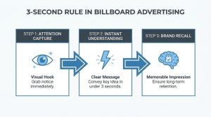
The 3-second rule in billboard advertising means your audience should be able to:
- Understand the message
- Recognize the brand
- Remember the key idea
…all within about three seconds.
If they can’t, the billboard usually fails.
Whether your billboard is on a highway in Dubai, in Times Square, or beside a busy urban intersection, the psychology is the same: people do not “read” billboards — they glance at them.
That’s why the best billboard campaigns are often the simplest.
Why 3 Seconds Matter
Unlike digital ads, billboards don’t give viewers time to process paragraphs, detailed explanations, or complicated offers.
Most billboard audiences are:
- Driving
- Walking quickly
- Looking at traffic
- Distracted by surroundings
- Processing multiple visual inputs simultaneously
Your billboard competes with:
- Cars
- Buildings
- Traffic lights
- Mobile phones
- Weather
- Other advertisements
The human brain filters aggressively in these environments.
A billboard only wins when the message is instantly clear.
What Makes a Billboard Effective in 3 Seconds?
- Short Headlines Win
The ideal billboard headline is usually:
- 5–7 words
- Maximum 10 words
- Instantly understandable
Good Example:
“Luxury Living Starts Here”
Bad Example:
“Discover Our Newly Developed Residential Community With Flexible Payment Plans”
People do not have time to decode complexity.
Clarity always beats cleverness.
- One Message Only
One of the biggest billboard mistakes is trying to communicate too much.
A billboard should not simultaneously explain:
- Company history
- Product features
- Discounts
- Website details
- Phone numbers
- Social media handles
- QR codes
- Testimonials
The audience remembers one thing best.
Choose it carefully.
Ask yourself:
“If someone remembers only one thing after passing this billboard, what should it be?”
That answer becomes the campaign.
- Large, Readable Typography
Typography can make or break billboard visibility.
Effective billboard text should:
- Be readable from far away
- Use high contrast
- Avoid thin fonts
- Avoid long sentences
- Use strong hierarchy
Many brands underestimate how small text appears at highway speed.
If your billboard requires effort to read, it is already too late.
- Strong Visual Hierarchy
The viewer’s eye should know exactly where to look first.
A typical high-performing billboard structure:
- Main visual
- Headline
- Brand logo
- CTA (if necessary)
When everything is emphasized, nothing stands out.
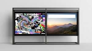
- Powerful Imagery Beats Complex Design
Billboards are visual-first media.
One striking image often performs better than:
- Multiple product shots
- Busy collages
- Overdesigned graphics
- Detailed illustrations
The best billboard visuals are:
- Bold
- Emotional
- High contrast
- Instantly recognizable
Minimalism usually performs better in outdoor advertising because simplicity increases processing speed.
The Psychology Behind the 3-Second Rule
The rule is deeply connected to cognitive load.
When viewers process information while moving, the brain prioritizes:
- Safety
- Navigation
- Motion detection
- Immediate relevance
This means billboard ads must rely on:
- Instant recognition
- Emotional triggers
- Familiar symbols
- Simple language
Brands that understand this create campaigns people remember for years.
Why Many Billboard Campaigns Fail
Most failed billboard ads have one thing in common:
They try to behave like websites.
A billboard is not:
- A brochure
- A landing page
- A catalog
- A PowerPoint presentation
Common mistakes include:
- Too much text
- Multiple CTAs
- Weak contrast
- Tiny logos
- Overcrowded layouts
- Excessive product information
If the audience needs to “study” the billboard, the campaign is already losing attention.
Does the 3-Second Rule Apply to Digital Billboards?
Yes — even more.
Digital billboards rotate between ads, reducing exposure time further.
In many cases, viewers may only see your creative for:
- 5–8 seconds total
- Or less depending on traffic speed
That makes simplicity even more critical.
For digital OOH campaigns:
- Use bold transitions carefully
- Avoid over-animation
- Keep messaging static and readable
- Design for motion environments
Movement should enhance the message, not distract from it.
The Best Billboard Campaigns Feel Instantly Understandable
Think about iconic outdoor campaigns from brands like:
- Apple
- Nike
- McDonald’s
They often use:
- Very few words
- One dominant visual
- Clear emotional association
- Immediate brand recognition
That’s the real secret behind memorable billboard advertising.
Not complexity.
Speed.
A Simple Billboard Testing Method
Before approving any billboard design, try this:
The 3-Second Test
Show the billboard to someone for only three seconds.
Then ask:
- What was the ad about?
- Which brand was it?
- What do you remember?
If they hesitate, the billboard likely needs simplification.
Final Thoughts
The 3-second rule is not about limiting creativity.
It’s about respecting how people actually consume outdoor media.
The strongest billboard campaigns understand that attention is scarce and speed matters.
A great billboard doesn’t explain everything.
It delivers one powerful idea instantly.
And in modern advertising, that ability is more valuable than ever.
Leave a Comment